Pivotal Labs x Orange

Consulting

Telco

Shipped

Context

As the first employee of Pivotal Labs Paris, my mission was to introduce a user-centered mindset and lean methodologies to big established french companies. I worked first on a 4-month project with Orange to address the challenge of low conversion rates for their B2B portal despite SMEs being a profitable segment. As the design lead, I collaborated with the team to run a discovery phase and implement a set of solutions : 23% increase in conversion rate and drop of customer calls labelled "issues on the website" by 40%.

In short

Orange Pro is a comprehensive website designed for french auto-entrepreneurs and small businesses, offering an extensive range of services such as internet boxes, mobile offers, accessories, and more. It serves as a one-stop-shop for all the essential needs of small businesses, empowering them with the necessary tools and resources to thrive in the digital world.

How it went

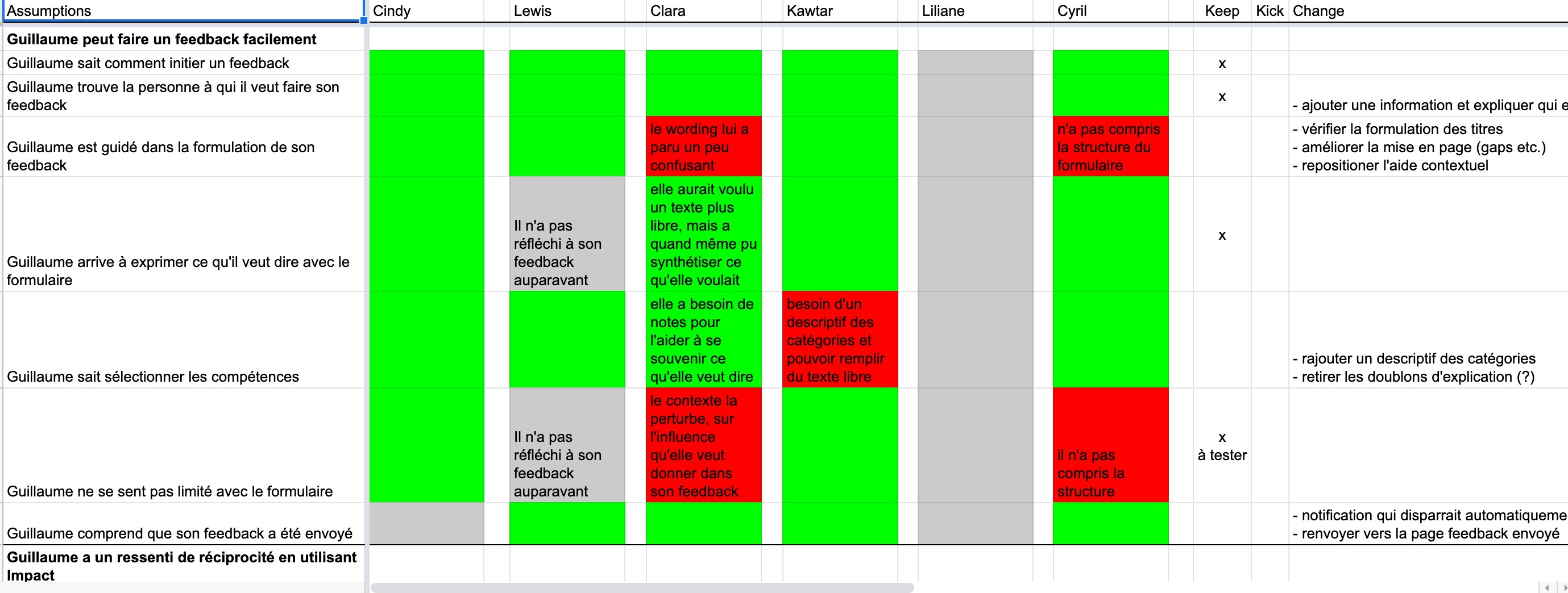
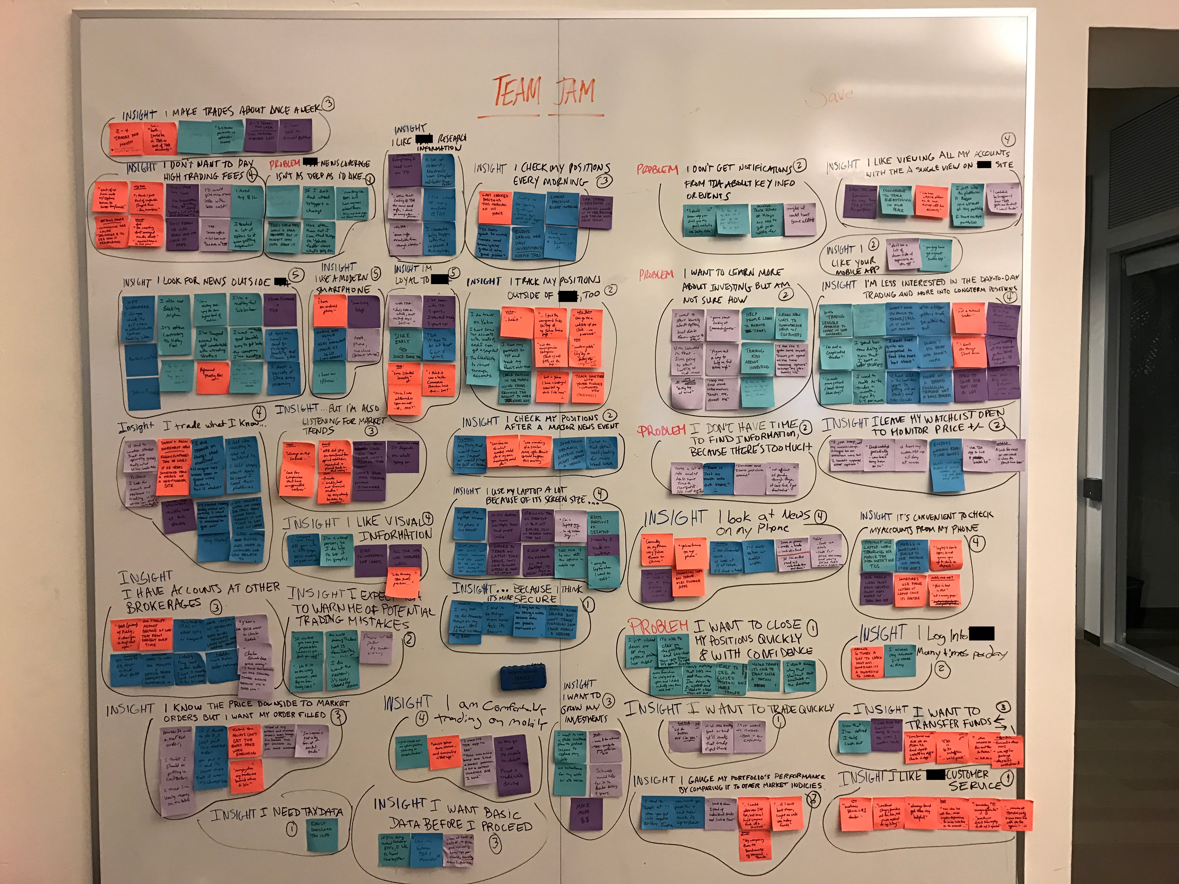
After conducting a rigorous "guerilla" user research strategy, which involved hiring business owners in the streets of Paris that matched the target persona, I led a series of insightful one-on-one interviews with both customers and non-customers to better understand their Internet and voice needs and struggles. Our findings revealed that a significant number of users were dropping out due to issues with the address verification feature, which was impacting their eligibility for offers. Additionally, the complex and overwhelming nature of the B2B offers was also causing users to quit.

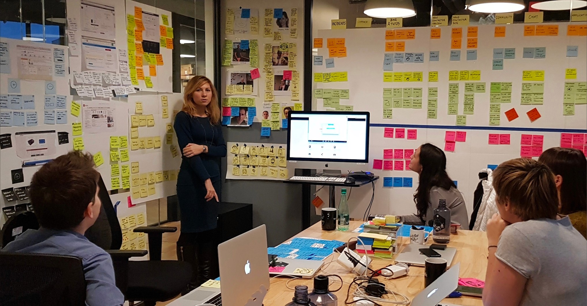
To address these issues, we organized a two-day workshop and created a service blueprint to map out the various interactions users have from order to delivery and setup. This allowed us to involve multiple teams that rarely interact together and identify quick wins. Our workshop highlighted the fact that customer service could have a significant impact by adding a chat button at critical moments during the checkout process to increase the percentage of users who successfully complete their purchase.

As part of our solution, we designed a simplified flow where eligibility check is front and center, and customer service chat is always visible to help users overcome any difficulties. We also improved the information hierarchy on the offer presentation pages and balanced the different levels of information across different pages. These changes ultimately improved the user experience and increased the conversion rate for Orange Pro's website.